Counting to a Million
The Amsterdam Data Project
Trained a neural network on fifty years of city data.
Shipped the results to public screens across Amesterdam. I built a system that ingested open data on births, deaths and migration, then used machine learning to predict future growth. As Amsterdam’s population approached one million, I wanted to get a feel for how people were moving through the city, how its suburbs were changing, and what those patterns might reveal about its future.
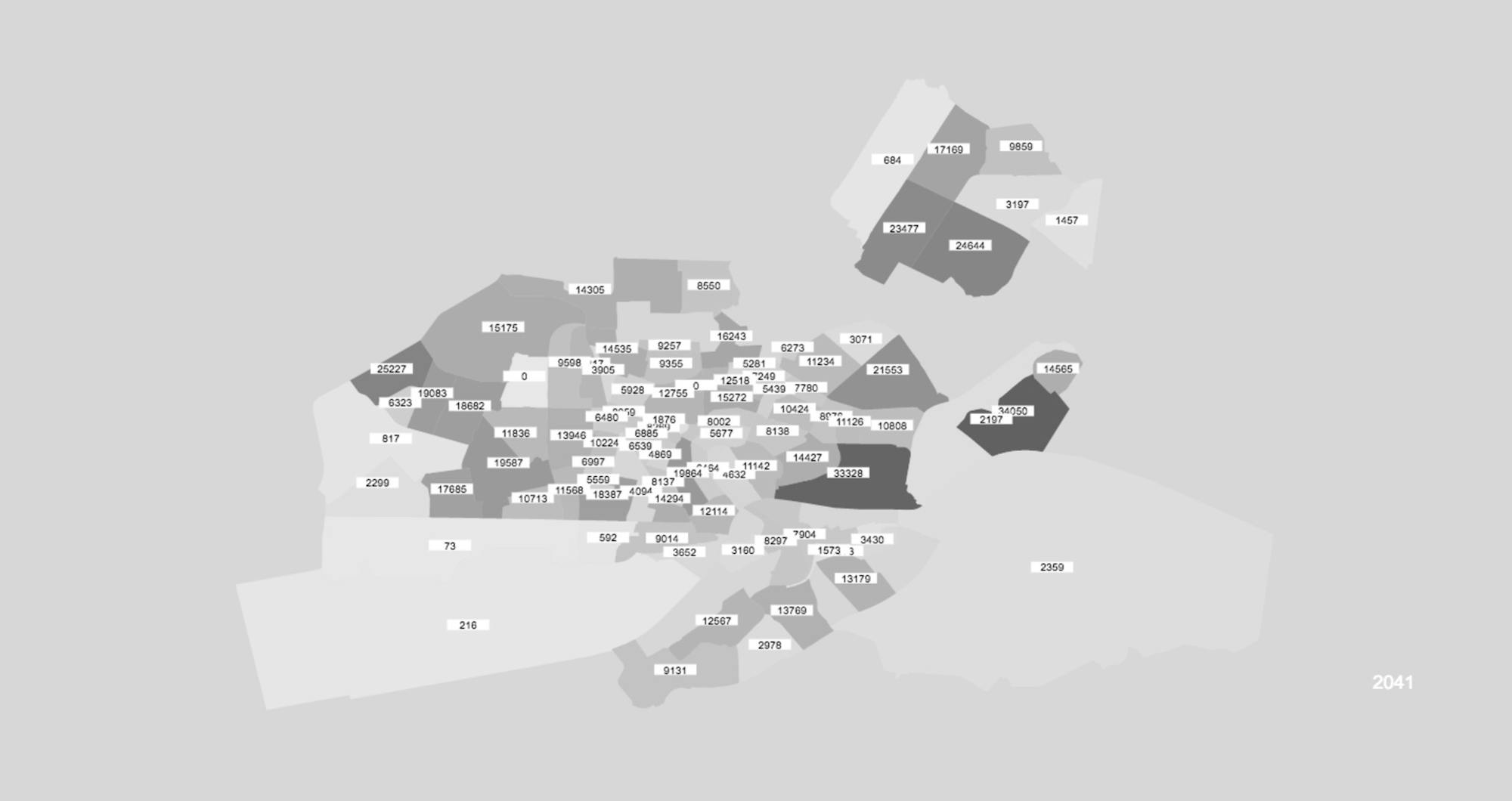
The data pipeline was as much of the work as the visuals.
Population data was merged with suburb geometry into a location-aware set plottable on Google Maps. This was the hard part — normalising incompatible schemas, filling gaps, making raw civic data usable as a creative input.
The commission came through a meeting at
Refik Anadol’s Architectural Intelligence Lab.
The remit: a new data sculpture every month for six months, deployed across the Netherlands' entire out-of-home screen network.
The predictions were not shown
as a dashboard.
They were rendered as a real‑time generative sculpture on the largest outdoor screens in the Netherlands.
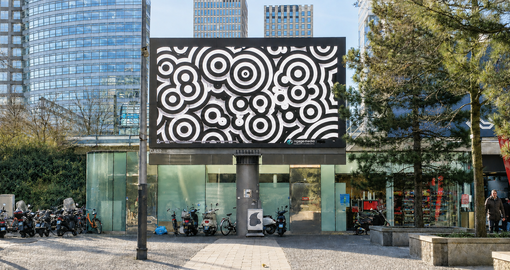
As with all my data projects, it is about experiencing the data.
I'm not so much interested in the charts, but how the viewer "feels" the data. And I wanted to not just look back, but use AI to predict how the city would feel 20 years into the future.
Attractors showed which growing suburbs had the strongest pull.
The larger population values exerted gravitational pull on neighbouring points, forming metaballs around the densest areas. As suburbs grew and shrank across the fifty-year timeline, the sculpture shifted revealing a physics‑based visualisation of demographic change.
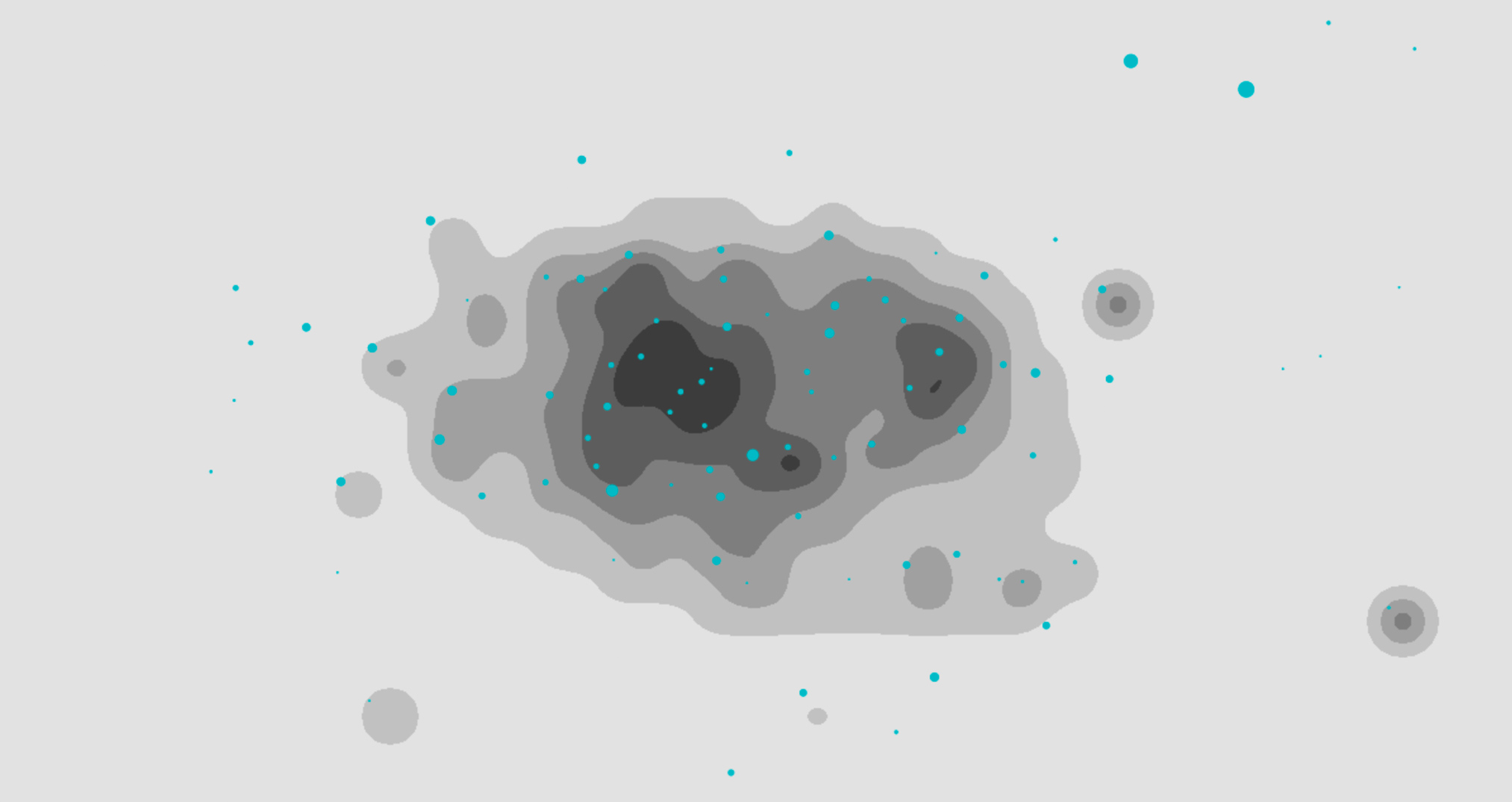
Version one was beautiful, but I wanted to push it more.
These were meant to be public artworks, so I also wants them to be as beautiful as possible. To stand up art public art, not just data viz. I decided to use a blobbing technique developed in my Code365 library (four years of creative coding - not missing a day of creative output), and this worked extrmeley well.
The early build used blurring
and posterisation.
A technique I had come to love to in my Code365 project for creativing a feeling of depth.
And so the graphic blobs were born.
Pure Javascript canvas, no libraries except my own, the blobs felt right the moment I "invented" them. Abstract, arresting, but still true to the data. Suburbs growing, shrinking, merging together.
The original white version.
The system was rebuilt to mimic the dat behaviour with a more graphic language: nearby data points merged. Depth came from layered drop shadows. The white backgrounds looked beautiful in my studio but way too bright on the street when we could finally test them on the massive LED screens.

The final black version.
Depth came from layered drop shadows. The white backgrounds looked beautiful in my studio but way too bright on the street when we could finally test them on the massive LED screens.

Fifty years of civic data augmented with AI. Millions of viewers.
The piece ran continuously every 30 mins from January through July 2018 on OOH media screens across Amsterdam's most heavily trafficed areas.